- Abdolrahmani, A., Storer, K. M., Roy, A. R. M., Kuber, R., & Branham, S. M. (2020). Blind leading the sighted: drawing design insights from blind users towards more productivity-oriented voice interfaces. ACM Transactions on Accessible Computing (TACCESS), 12(4), 1-35.
- Dobel, C., Nestler-Collatz, B., Guntinas-Lichius, O., Schweinberger, S. R., & Zäske, R. (2020). Deaf signers outperform hearing non-signers in recognizing happy facial expressions. Psychological research, 84, 1485-1494.
- Han, C., Mitra, P., & Billah, S. M. (2024, May). Uncovering Human Traits in Determining Real and Spoofed Audio: Insights from Blind and Sighted Individuals. In Proceedings of the CHI Conference on Human Factors in Computing Systems (pp. 1-14).
- Pang, W., Xing, H., Zhang, L., Shu, H., & Zhang, Y. (2020). Superiority of blind over sighted listeners in voice recognition. The Journal of the Acoustical Society of America, 148(2), EL208-EL213.
- Grant, A., & Kara, H. (2021). Considering the Autistic advantage in qualitative research: the strengths of Autistic researchers. Contemporary Social Science, 16(5), 589-603.
- Taylor, H., & Vestergaard, M. D. (2022). Developmental dyslexia: disorder or specialization in exploration?. Frontiers in psychology, 13, 889245.
- Schippers, L. M., Horstman, L. I., Velde, H. V. D., Pereira, R. R., Zinkstok, J., Mostert, J. C., … & Hoogman, M. (2022). A qualitative and quantitative study of self-reported positive characteristics of individuals with ADHD. Frontiers in Psychiatry, 13, 922788.
- Bury, S. M., Hedley, D., Uljarević, M., & Gal, E. (2020). The autism advantage at work: A critical and systematic review of current evidence. Research in Developmental Disabilities, 105, 103750.
- Hatak, I., Chang, M., Harms, R., & Wiklund, J. (2021). ADHD symptoms, entrepreneurial passion, and entrepreneurial performance. Small business economics, 57, 1693-1713.
Upholding respect among colleagues and peers is essential for innovation. A commitment to mutual respect enhances the quality of discourse and promotes effective teamwork in the field of data science and related areas.
There are many studies on the relationship between tools, respect, and teaming for success:
- Castro, Franz, et al. “Experiences of researchers with disabilities at academic institutions in the United States.” Plos one 19.8 (2024): e0299612.
- Croker, Anne, and Joy Higgs. “The RESPECT model of collaboration.” Collaborating in Healthcare: Reinterpreting Therapeutic Relationships. Rotterdam: SensePublishers, (2016). 43-54.
- Dobni, C. Brooke. “The DNA of innovation.” Journal of Business Strategy 29, no. 2 (2008): 43-50.
- Dovey, Ken. “The role of trust in innovation.” The learning organization 16, no. 4 (2009): 311-325.
- Hwang, I‐Ting, et al. “How people with intellectual and developmental disabilities on collaborative research teams use technology: A rapid scoping review.” Journal of Applied Research in Intellectual Disabilities 35.1 (2022): 88-111.
- Frohman, Alan L. “Managers at work: Building a culture for innovation.” Research-Technology Management 41, no. 2 (1998): 9-12.
- Wu, Jia Rung, et al. “Employer practices for integrating people with disabilities into the workplace: a scoping review.” Rehabilitation Research, Policy, and Education 37.1 (2023): 60-79.
What can a data creator control?
- Open or proprietary?
- Common or low use?
- Supported by many software platforms or only one?
- Freestanding or reliant on embedded programs, files, or scripts?
- Lossless or lossy?
Language forms the basis of human interoperability for shareable data. A data creator has a great deal of control over the language they choose to use for documentation and metadata, and the standards they choose to adhere to. In our data documentation discussion we presented the importance of not making assumptions about your data user from an interdisciplinary standpoint. This is also important from an equitable accessibility standpoint.
The critical concept here is clarity and precision. Datasets and their associated metadata/documentation should avoid words and phrases with “double meanings” as much as possible, because it can skew both understanding and interpretation of data. We list a few guiding principles to consider.
- Avoid using idiomatic expressions. Because open data is intended for an international audience, researchers without a shared cultural background may misinterpret idioms or turns of phrase.
- Common Example: “Set the stage” is a fairly common idiom referring to “creating the necessary conditions and context for something to happen” (Top 20 commonly used idioms for research writing). However, in domains like materials science and chemistry there are actual physical stages frequently set up as a part of methodology. Be precise in describing methodology and careful with reference to common experimental phrases.
- Avoid analogy.
- Common Example: “master/slave” is used in numerous contexts, including particle in cell flow computation, parallel runtime execution models, periodic boundary conditions, file systems, hard drive technology, grid computing, and graph traversal. Because it is an analogy, it covers too many potential relationships, making it difficult for data users to be precise. Use alternatives that clearly define the desired relationship, such as “hierarchical”, “primary-secondary”, “active-passive”, “origin-clone” or “local-remote.”
- Common Example: “dummy value” is particularly common in data science, but has multiple potential meanings for what the value is and how it is represented in a given data set. The use of the word “dummy” can be misleading. Words such as “placeholder value”, “sample value”, or “test data/test value” more precisely capture the nature of the value in the data context.
- Avoid overly general adjectives.
- Common Example: Words describing age are particularly susceptible to ambiguity. Avoid adjectives like “elderly”, “young”, or “middle aged” in favor of exact age demographics (persons over 65, persons between the ages of 12-14″ etc. As with idioms, international interoperability is also key. Different countries define different age ranges for “child” or “adult.” Similarly, defining age based on a culture specific phenomenon (i.e. “high-school aged” or “elementary school aged”) should be avoided.
- Be careful with commonly used words that have special meanings in data science.
- Common Example: “Minority” has a specific meaning in data science, meaning a part that is less than half a whole number. However, has also historically been used to refer to traditionally underserved or underrepresented communities. Use the right word(s) to describe your specific data.
- Common Example: “Normal” is a deeply overloaded term in data science, math, and statistics, and should be avoided if possible. When using the word “normal” to denote, for example, a person without disabilities, it is clearer to use words such as “nondisabled person,” “sighted person,” “hearing person”, “neurotypical person” etc. with specific reference to your study. When using normal to refer to non-anomalous state for a given experiment, it is better to use the word “non-anomalous” or “desired state.”
There are many comprehensive resources on language standards in scientific contexts, Cambridge Proofreading, LetPub, and APA Style are great starting resources.
- Separate ideas with whitespace
- Use bullets
- Bold rather than italicize important words
- Be consistent
camelCase: First word lower case, first letter of each subsequent word upper case.PascalCase: First letter of every word upper case.snake_case: All lower case, words separated by underscore.SCREAMING_SNAKE_CASE: All upper case, words separated by underscore
Text Components
plt.rcParams.update({'font.size': 12})

plt.savefig(f'data_image.png', dpi=300)
plt.savefig(f'data_image.svg')
Color
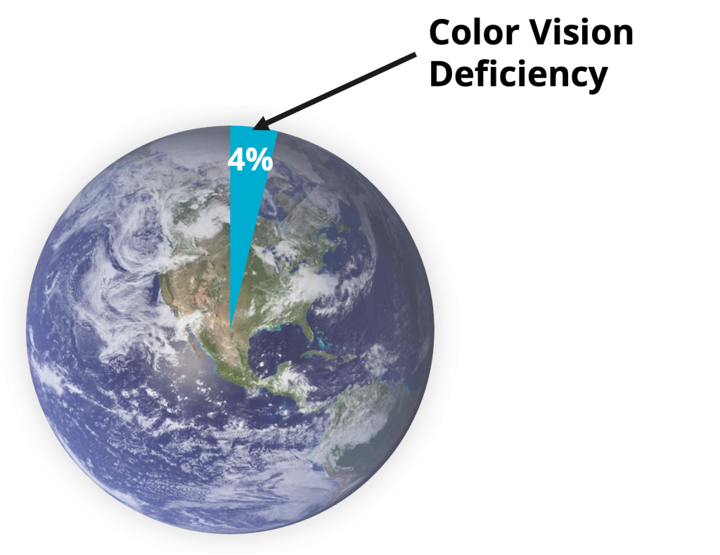
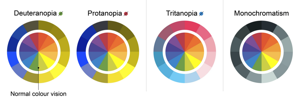
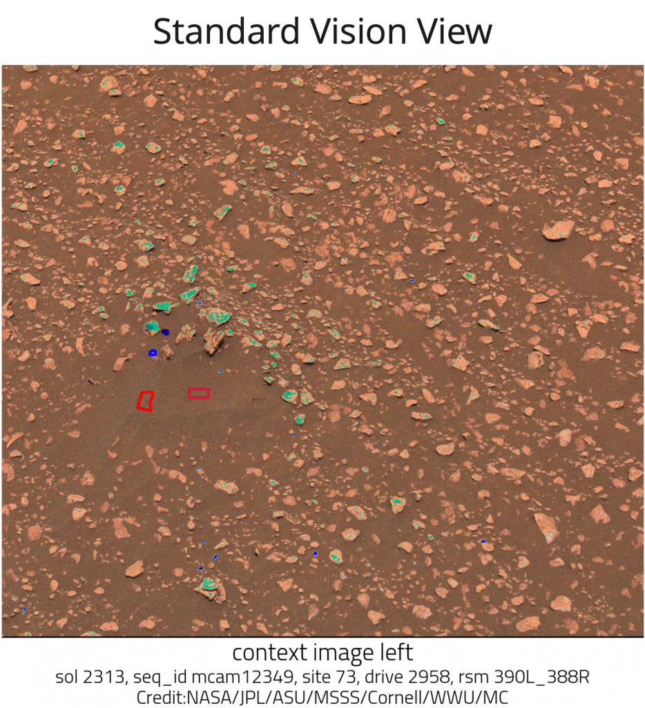
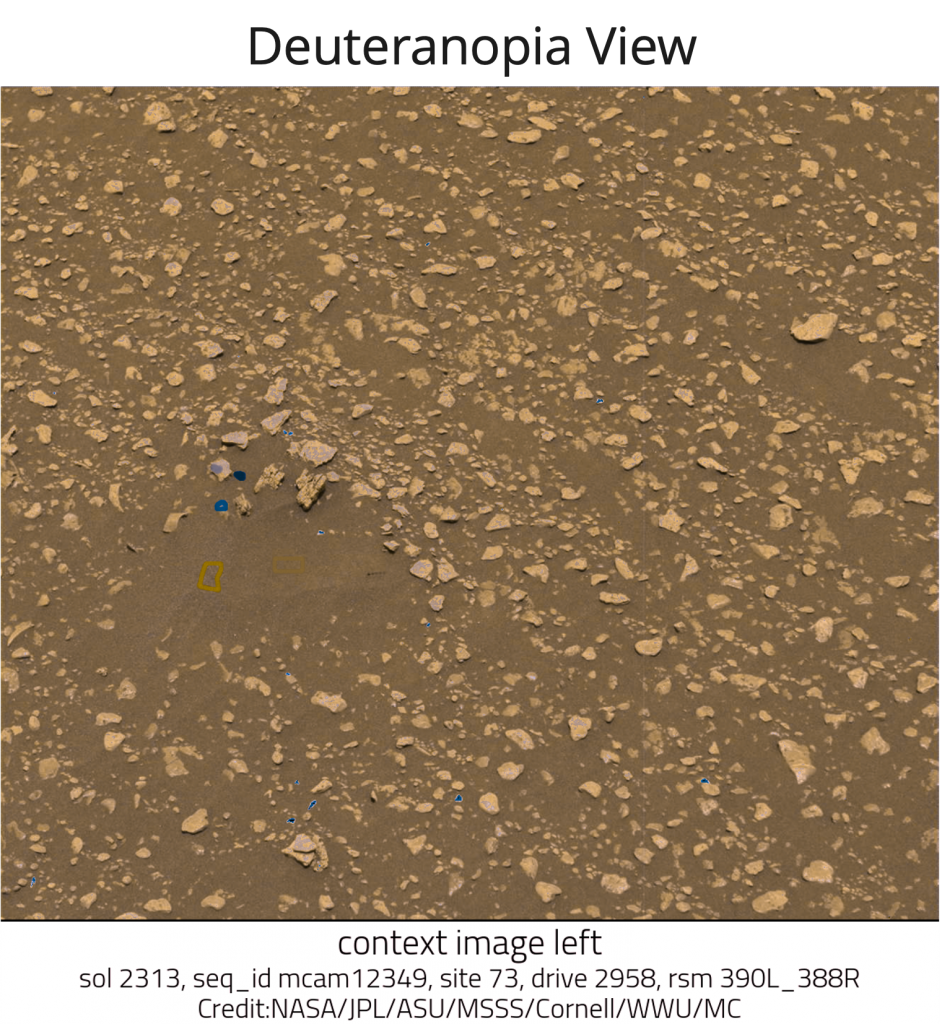
- Protanopia – Reduces sensitivity to red light
- Deuteranopia – Reduces sensitivity to green light
- Tritanopia – Reduces sensitivity to blue light
- Achromatopsia -A total loss or reduction of all three colors
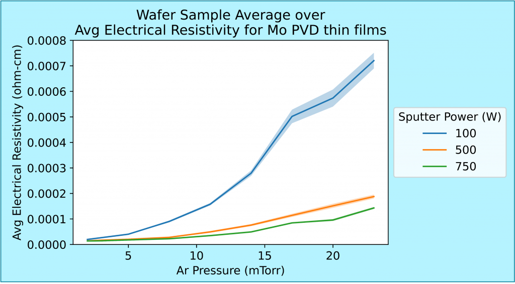
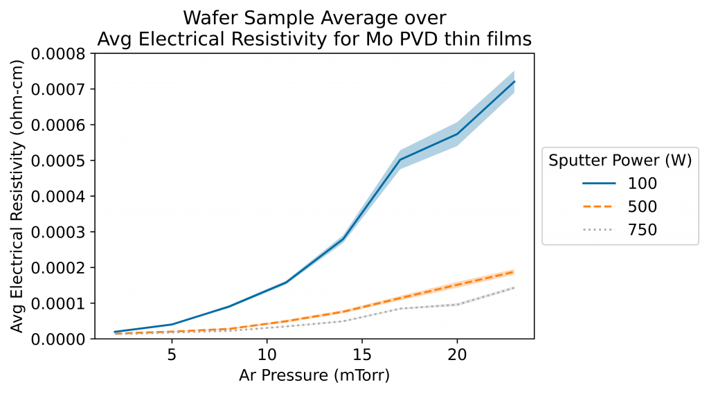
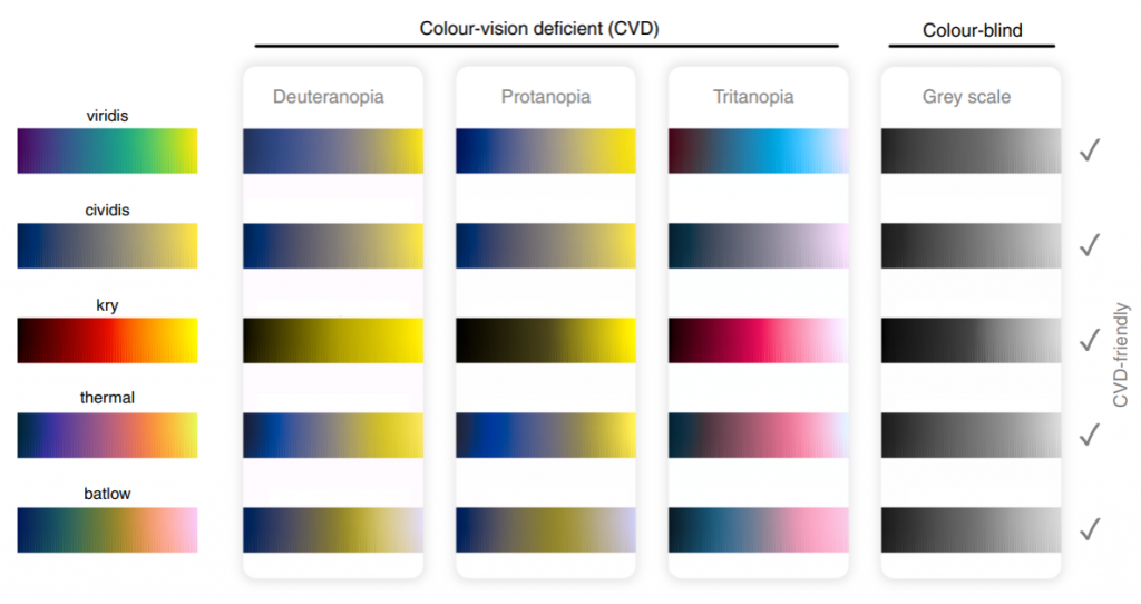
plt.style.use('tableau-colorblind10')
plt.rcParams['image.cmap'] = 'cividis'
Alternative Text

- Convey the content
- Mention color (if it is important to understanding the image)
- Share humor
- Transcribe text

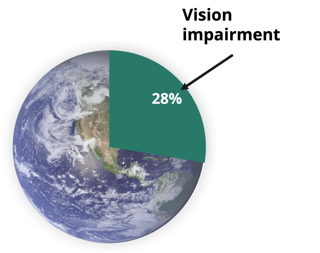
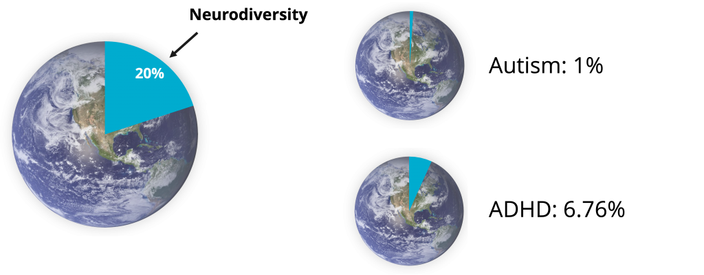
- An image of the planet Earth depicting the portion of the world (28%) with vision impairment
- A pie chart of planet Earth where a 28%slice represents the portion of the population with vision impairment
class thisdoessomething:
    def func(self, x, y):
        return y**2 + y*x + x**3
    def next(self, y, x, h):
        y_j = y + h*self.func(x, y)
        x_j = x + h
return y_j, x_jclass EULERS_METHOD:
def derivative_function(self, x, y):
return y**2 + y*x + x**3
def numerical_approximation(self,
current_function_value,
current_step_value, step_size):
approximate_value = current_function_value + step_size *
self.derivative_function(current_step_value,
current_function_value)
next_step_value = current_step_value + step_size
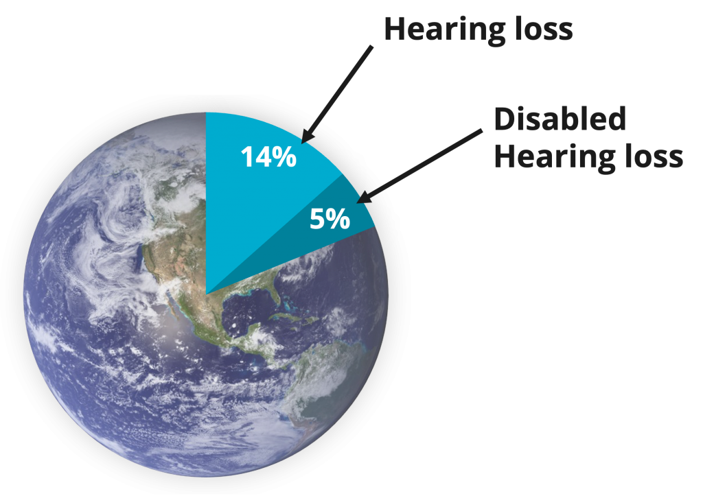
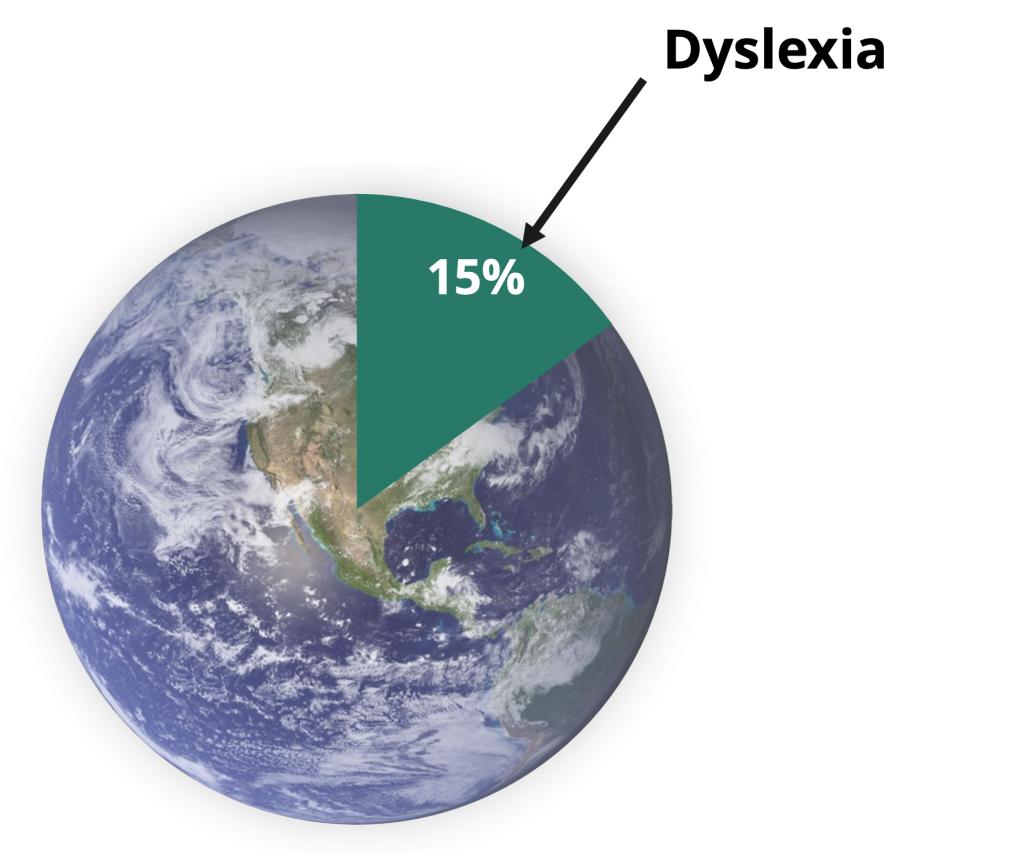
return approximate_value, next_step_value- Why Equitable Accessibility Matters – Statistics
- Why Equitable Accessibility Matters – Perspective
- Abdolrahmani, A., Storer, K. M., Roy, A. R. M., Kuber, R., & Branham, S. M. (2020). Blind leading the sighted: drawing design insights from blind users towards more productivity-oriented voice interfaces. ACM Transactions on Accessible Computing (TACCESS), 12(4), 1-35.
- Dobel, C., Nestler-Collatz, B., Guntinas-Lichius, O., Schweinberger, S. R., & Zäske, R. (2020). Deaf signers outperform hearing non-signers in recognizing happy facial expressions. Psychological research, 84, 1485-1494.
- Han, C., Mitra, P., & Billah, S. M. (2024, May). Uncovering Human Traits in Determining Real and Spoofed Audio: Insights from Blind and Sighted Individuals. In Proceedings of the CHI Conference on Human Factors in Computing Systems (pp. 1-14).
- Pang, W., Xing, H., Zhang, L., Shu, H., & Zhang, Y. (2020). Superiority of blind over sighted listeners in voice recognition. The Journal of the Acoustical Society of America, 148(2), EL208-EL213.
- Grant, A., & Kara, H. (2021). Considering the Autistic advantage in qualitative research: the strengths of Autistic researchers. Contemporary Social Science, 16(5), 589-603.
- Taylor, H., & Vestergaard, M. D. (2022). Developmental dyslexia: disorder or specialization in exploration?. Frontiers in psychology, 13, 889245.
- Schippers, L. M., Horstman, L. I., Velde, H. V. D., Pereira, R. R., Zinkstok, J., Mostert, J. C., … & Hoogman, M. (2022). A qualitative and quantitative study of self-reported positive characteristics of individuals with ADHD. Frontiers in Psychiatry, 13, 922788.
- Bury, S. M., Hedley, D., Uljarević, M., & Gal, E. (2020). The autism advantage at work: A critical and systematic review of current evidence. Research in Developmental Disabilities, 105, 103750.
- Hatak, I., Chang, M., Harms, R., & Wiklund, J. (2021). ADHD symptoms, entrepreneurial passion, and entrepreneurial performance. Small business economics, 57, 1693-1713.
- Language
- Eglash, Ron. “Broken metaphor: The master-slave analogy in technical literature.” Technology and culture 48, no. 2 (2007): 360-369.
- University of Wisconsin “IT Inclusive Language Guide” https://it.uw.edu/guides/identity-diversity-inclusion/inclusive-language-guide/
- Paperpal “Top 20 Commonly Used Idioms for Research Writing.” https://paperpal.com/blog/academic-writing-guides/language-grammar/idioms-research-writing
- Cambridge Proofreading “Words to Avoid in Academic Writing.” https://proofreading.org/blog/words-to-avoid-in-academic-writing/
- LetPub “Avoiding Informal Language in Scientific Manuscripts.” https://www.letpub.com/Avoiding-Informal-Language-in-Scientific-Manuscripts
- APA Style “Bias-Free Language” https://apastyle.apa.org/style-grammar-guidelines/bias-free-language
- Generated Graphs and Plots
- Color vision deficiency types: https://www.allaboutvision.com/conditions/color-blindness/types-of-color-blindness/
- Alivia Eng, M. R. (2023). Mastcam Image Data (Sols 2303-3672) [Data set]. Zenodo. https://doi.org/10.5281/zenodo.8339229
- Crameri, F., Shephard, G. E., & Heron, P. J. (2020). The misuse of colour in science communication. Nature communications, 11(1), 5444.
- Vilkin, Aleksey and Safonov, Ilia. (2014). Newspaper and magazine images segmentation dataset. UCI Machine Learning Repository. https://doi.org/10.24432/C5N60V
matplotlibcolormaps: https://matplotlib.org/stable/users/explain/colors/colormaps.html- Perceptually uniform colormap HEX/rgb generator: https://hauselin.github.io/colorpalettejs/